CONCLUSIONS & WHAT’S NEXT
Dreamy now delivers a calm, night-first experience: quick capture, Record without tapping, Sensitive/Resolved privacy, clear Therapy Export with comments, mood tagging by swipe, and a consistent dark-mode system powered by tokens and reusable components. The result feels intuitive, reassuring, and scalable.


WHAT WORKED (VALIDATED IN PROTOTYPE)
Lower cognitive load: one primary action per screen.
Safety & recovery: drafts, confirmations, and clear success states.
Privacy & progress: Sensitive/Resolved provide control and closure.
Therapy handoff: scoped export + note + feedback thread.
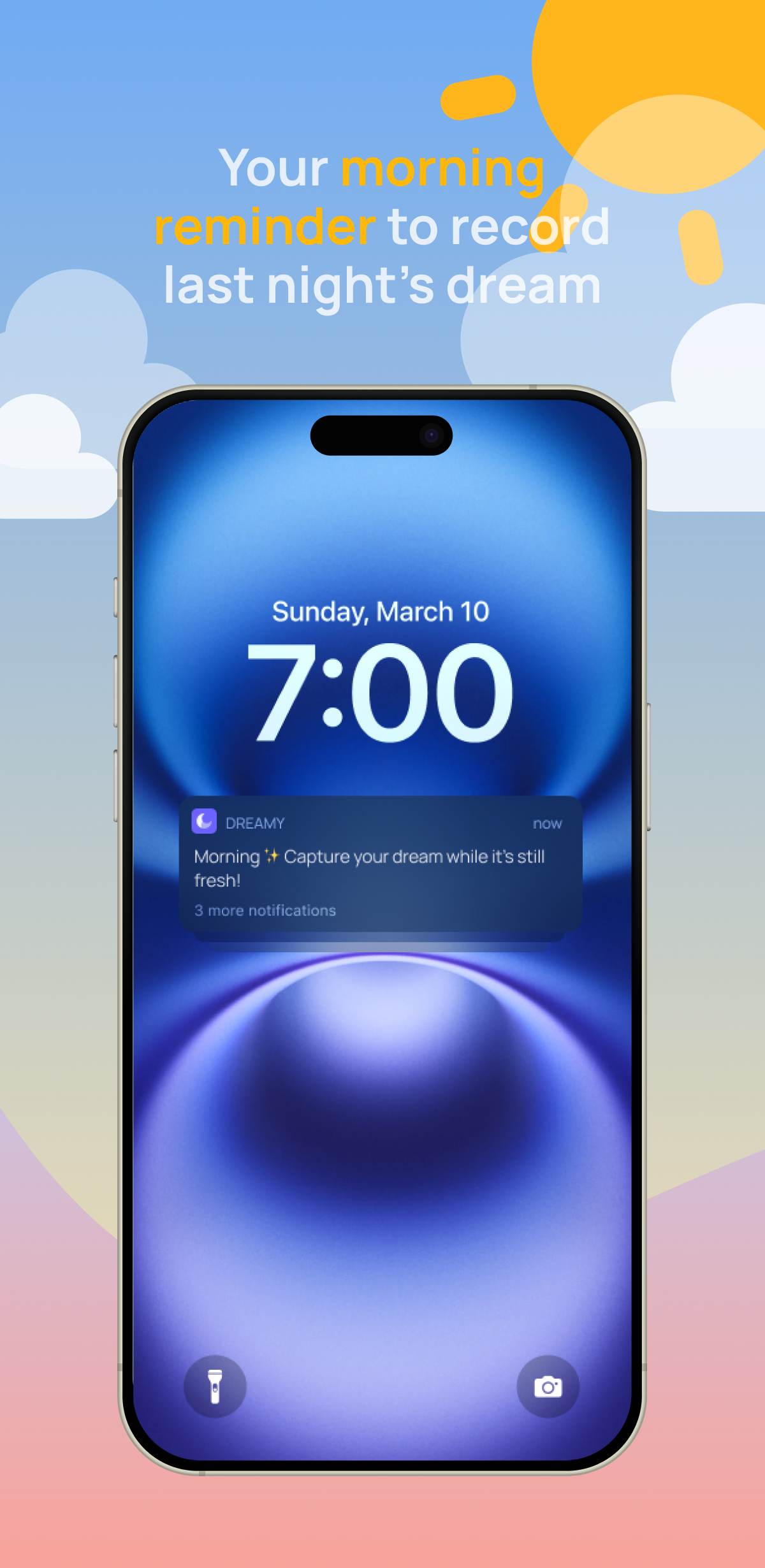
Hands-free capture: trigger phrase increases real-world utility.
Consistency: tokens + variants keep UI predictable across flows.
..


CONNECTING THE DOTS

The prototype shows strong foundations, yet several areas merit deeper exploration. The opportunities below are pre-hi-fi-validation hypotheses: derived from heuristic review and early qualitative signals, not confirmed by a dedicated hi-fi usability round yet. My next study will validate or refute these assumptions; any recurring friction or unmet expectation observed across participants will be redesigned: simplifying flows, clarifying guidance, or strengthening information architecture, to move Dreamy toward a cohesive version 1. Decisions to change will be evidence-led, using the planned usability measures and light analytics to prioritize what delivers the clearest improvement in user experience.
WHAT TO CHANGE
Contrast & legibility on dark UI and mood cards (edge states, disabled, hover);
Editing limitations after saving a dream;
Recording flow complexity (save/stop ambiguity; attachment friction);
Sensitive mode discoverability & scope understanding;
Mood selection via swipe feels ambiguous to some;
AI interpretations are conceptual, not yet validated;
Voice trigger onboarding not explicit enough;
Library retrieval can be faster for power tasks;
Notifications load may create fatigue;
Accessibility polish (targets, motion, focus order).
OPPORTUNITIES
Boost contrast and clarity so everything stays readable at night;
Allow edits later and show a simple “Edited” timestamp;
Make recording one clear path with a safe Save as draft and a single, obvious finish;
Bring privacy forward, explain it in one short line, and show a clear badge when it’s on;
Add labels and snap-to choices, plus an optional picker for precision;
Start small with opt-in insights that explain themselves and are easy to turn off;
Add a friendly guided setup with a quick self-test so users feel confident;
Add better filters, smarter search, and saved views to get there faster;
Offer quiet hours and weekly digests by default, with simple controls;
Make tap areas larger, keep motion gentle for those who prefer less, and ensure clear focus highlights.

VALIDATION PLAN (PRE-ITERATION)
To keep Dreamy strictly user-centered, the next cycle begins with a focused hi-fi usability validation to confirm these directions before making changes.
Participants: 6-8 across Laura, Sonia, Alex; remote, moderated;
Tasks: Record - Draft - Save; Morning Prompt; Export & view comments; Sensitive/Resolved; Mood selection; Voice trigger setup;
Measures: Task Success, Time on Task, Error rate, SEQ (per task), qualitative notes;
Bias controls: external recruiting, randomized task order, scripted prompts, second observer, screen recording;
Analytics to instrument: Record - Draft - Save funnel, Voice Trigger adoption, Sensitive/Resolved usage, Export completion, Library search/filter usage.