EMPATHIZE = TESTING?
To ground the redesign in evidence, I ran moderated, task-based usability tests on PLATO’s existing website, followed immediately by short 1:1 interviews. Each participant attempted realistic tasks, while I observed paths, errors, hesitations, and verbalized pain points; the brief debrief captured expectations and unmet needs in their own words. This format is standard for qualitative usability work and keeps tasks anchored in real user goals.
- TEST
- EMPATHIZE
- DEFINE
- IDEATE
-DESIGN
- TEST - EMPATHIZE - DEFINE - IDEATE -DESIGN
PARTICIPANTS & SCOPE
5–6 participants (mix of tourist art lovers, locals/parents, and an architecture enthusiast). This sample size is widely accepted to uncover the majority of critical issues in qualitative tests while staying efficient.
TASKS EVALUETED
Pick an exhibition to visit (find current events, dates, location, next steps);
Explore Archives / About (find building story, context);
Plan a visit (hours, prices, accessibility, directions/transport);
Support the gallery (fan/support/love: find options and next action);

1. Task Flow: Find an Exhibition to Visit
Path tested: Homepage - Menu - Exhibitions
Findings:
Opening hours were not visible in the exhibition flow.
No direct CTA to buy tickets or donate from the exhibition page.
Exhibition pages displayed rich content and images, but text hierarchy was unclear, making details harder to scan.
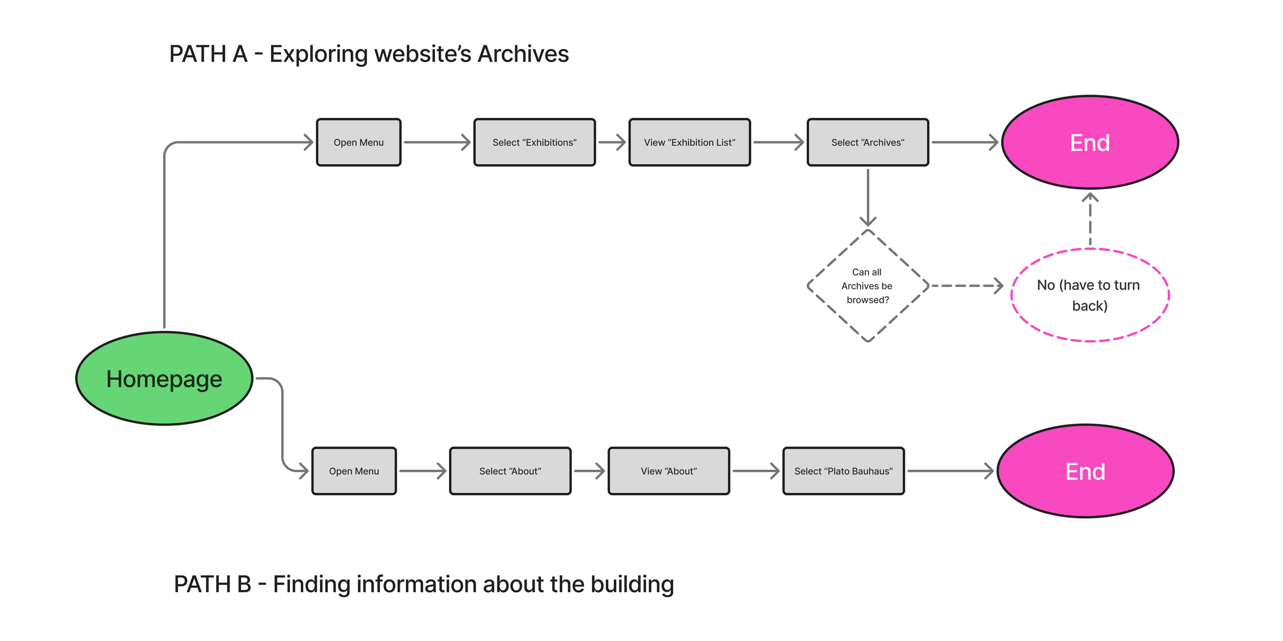
2. Task Flow: Explore Archives & Building Information
Path tested:
Homepage - Exhibitions - Archives
Homepage - Menu - About - Plato Bauhaus
Findings:
Archives are fragmented; users can only access them section by section (e.g., exhibitions or projects separately).
To view archives, users must backtrack through multiple pages, which breaks the flow.
Opportunity identified: create a dedicated Archives hub with filters for exhibitions, projects, and press.
About/Plato Bauhaus page was overloaded with condensed text and lacked clear hierarchy.

3. Task Flow: Plan a Visit
Path tested: Homepage - Menu - Visit
Findings:
Essential info (hours, prices, maps, accessibility) is present, but the section is nested and difficult to scan.
No CTA to buy tickets or book a class directly from the Visit section.
Lack of visual hierarchy made scanning slow and disorienting.

4. Task Flow: Support the Gallery (Become a Fan/ Supporter/ Share love)
Path tested: Homepage - Hero Carousel - Exhibition - Options for donations - Deadend - Homepage - Menu - About - Billing information - Bank account listed
Findings:
Users could see “Support” options, but there was no CTA to act (Donate/Join).
Donation info redirected back to Homepage and then buried under billing information (bank account only).
This path was confusing and unintuitive, discouraging donations.
Opportunity identified: add a persistent, balanced donation CTA across the site (footer, sidebar, or exhibition pages) without being intrusive.
HOW I ANALYZED ISSUES
Task design: Each scenario was framed from user goals (e.g., “You’re planning a visit with a friend, find opening hours and ticket prices”) without giving “how-to” clues. This ensured unbiased navigation paths.
Source: Nielsen Norman Group, Task Scenarios for Usability Testing*Severity rating: Every observed issue was scored on a 0-4 scale (0 = cosmetic, 4=catastrophe) to prioritize fixes by impact.
Source: Nielsen Norman Group, Severity Ratings for Usability Problems*Post-task metric (SEQ): At the end of each task, participants answered the Single Ease Question (SEQ): “How easy or difficult was this task?” (1 = very difficult, 7 = very easy). This quantified perceived difficulty.
Source: Nielsen Norman Group, Single Ease Question (SEQ)*Synthesis: Notes and quotes were clustered through affinity diagramming to reveal recurring patterns and pain points across users.
Source: Nielsen Norman Group, Affinity Diagramming for UX Research*Accessibility check: Typography issues were flagged against accessibility guidelines (baseline ~15-16px body size, scalable text).
Source: Section508.gov, Web Accessibility Standards*

Headline KPIs
Overall Task Success: 66%
- Usability is workable but inconsistent; two flows succeed, two underperform.Average SEQ (1–7): 3.6 (~43% SEQ%)
- Perceived effort is “somewhat difficult.” Tasks aren’t effortless.Average Time on Task: ~124s
- Users needed ~2 minutes per task; navigation and scanning are slow.Average Errors: ~1.7 per task
- Backtracks/misclicks show weak information scent and labeling friction.
WHAT THESE SHOWS?
Calls-to-Action are missing at the decision moment
Users find content but can’t act (Buy, Book, Donate).
Information Architecture is too nested
Backtracking + time penalties across Archives/Visit.
Content hierarchy and legibility need structure
Dense blocks + small type slow scanning and lower SEQ.
DESIGN DECISIONS DRIVEN BY DATA
Add persistent, context-aware CTAs:
Create an Archives hub with filters:
Restructure Visit into scannable subsections:
Tighten hierarchy & legibility