UI & Design System
I rebuilt PLATO’s interface by staying true to its bold identity (pink, neon green, white) while grounding every decision in the flows validated during Empathize, Define, Ideate and usability testing of the existing site. Instead of relying on text size alone, I used a card-based layout to create clear hierarchy and scannability: applying Gestalt principles like proximity, similarity, common region, and figure ground to group content, reveal relationships, and reduce cognitive load. Primary actions are consistently surfaced on cards; supporting details live one level down; and accent colors guide attention without overwhelming reading surfaces. The result is a cleaner, faster UI where teachers, visitors, and art lovers can follow familiar flows with less effort and the brand feels unmistakably PLATO at every step.

BRAND IDENTITY
PLATO already has a distinctive brand system, bold neon palette, punchy typography, and a clear graphic voice, so my redesign kept that identity intact while improving structure and flows. I selected Satoshi as a close typographic match to their geometric grotesk, ensuring headings, labels, and numerals feel native to PLATO. The UI applies the brand colors (pink, neon green, white) across surfaces, cards, and buttons, with yellow/grey used sparingly for programme highlights and background structure, and black for crisp, readable type. Components (cards, chips, buttons, tabs) were rebuilt on the same visual language, consistent borders, and spacing, so the interface feels familiar even as the IA, task flows, and hierarchy were simplified. In short: same PLATO personality, clearer paths to action.


COLOR PALETTE & TYPOGRAPHY
PLATO’s UI runs on a primary palette of pink (fuchsia), neon green, and white, used across surfaces, cards, and buttons to keep the brand instantly recognizable. Yellow and grey appear sparingly in Programme screens and subtle background panels to add structure and rest. Black anchors typography for clear, high contrast reading while the neon accents energize the interface without overpowering content.


GRID & COMPONENTS
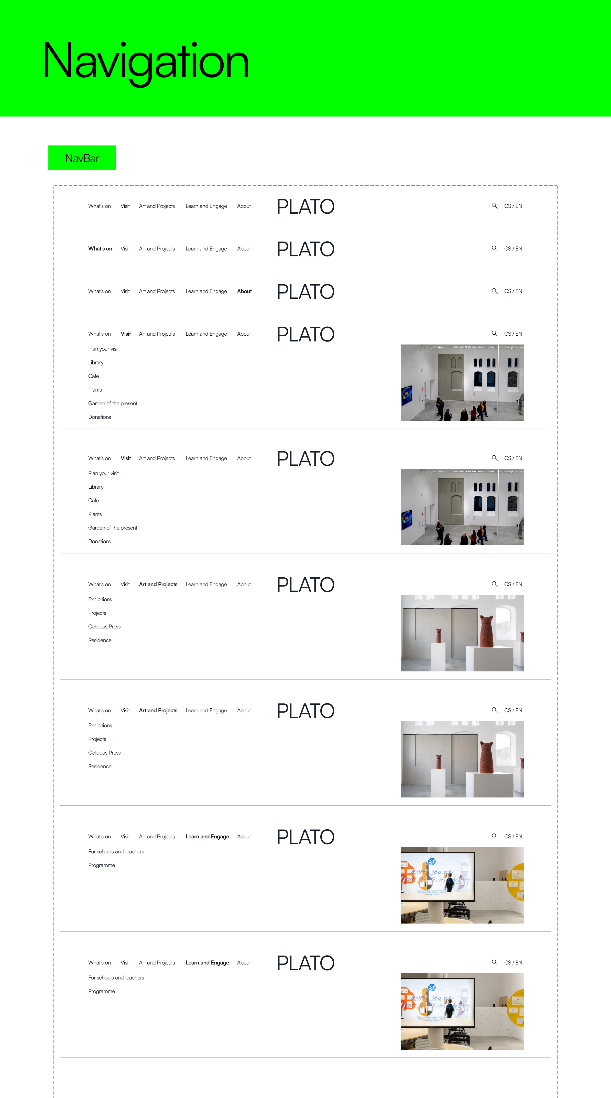
The interface sits on a 12-column responsive grid, with the navbar, buttons, and footer built as reusable components for consistency. I kept PLATO’s rectangular geometry and neon accents front and center, clean blocks for structure, neon for CTAs and active states, so the layout scales from mobile to desktop while preserving the gallery’s bold visual voice.
Redesigned navbar: No hamburger: an expanded menu with dropdowns surfaces all pages and sections for faster wayfinding.

Existing PLATO hamburger menu: a right-side overlay that slides over the current page, revealing all pages and sections in a full-height panel: https://plato-ostrava.cz/en/Vystavy

New footer: Keeps essentials (address, social) and adds About, Support, and Newsletter signup, making it easier to reach PLATO’s team and stay connected at the end of the scroll.

BUTTONS
Buttons: Bold, rectangular, and high-contrast, they were my first lever to simplify the flows. Clear CTAs: Buy ticket, Explore, View archive, Plan your visit, sit in predictable spots with consistent sizing and hover cues, so users act without hunting. The result: faster decisions, larger tap targets, and CTAs that carry PLATO’s neon identity across every page.

ANOTHER WAY OF EXPLORING PLATO
I chose an interactive 3D model for the hero to turn the homepage into a spatial index, not just a poster. Visitors can orbit, zoom, and tap hotspots to jump straight into exhibitions, routes, and visit info: building a mental map before they click. The model carries PLATO’s look, rectangular geometry and neon accents, so it feels on-brand while adding purpose to exploration. Net result: a more engaging, memorable entry that shortens the path into What’s On and Visit without compromising the identity.

3D model f PLATO - model made in Archicad
Final mockup: Homepage: Interactive 3D hero turns the gallery into navigation - explore spaces, tap hotspots, dive into exhibitions.


INTERACTIONS
I kept PLATO’s brand intact not just visually but in motion. The neon palette, rectangular blocks, and crisp black type carry into every component, and the original hover cues: subtle outlines, glow/underline hints, gentle shifts, were adapted to a card-based layout. Exhibitions moved from plain text to cards for clearer hierarchy and scanability; on hover, cards reveal inviting microcopy that guides clicks without clutter. The result feels unmistakably PLATO, with interactions that echo the existing design system while making navigation faster and more intentional.
Hover cues, dropdown transitions, and keyboard focus paths in action in new prototype.
Hover cues in existent PLATO’s website.
Final mockup - Buy Ticket: From What’s On to confirmation in four clear steps: choose show, pick a slot, checkout, done.


