FRAMING THE PROBLEMS
Identifying the problems that users face is one of the most important stages of UX design. Research showed clear pain points: users struggled to find basic visit information, archives felt fragmented, and calls-to-action (Buy ticket, Donate, Book) were often missing at decision moments. But beyond what users explicitly said, I also needed to interpret the unspoken frustrations: feeling lost in dense content, discouraged when donation flows stalled, or unsure when planning a family visit.
Using the 5 Ws and H framework (who, what, where, when, why, how) helped translate these insights into problem statements that captured both functional and emotional needs.
VALUE PROPOSITIONS
Surface essentials: Hours, prices, and tickets always visible in context.
Empower action: CTAs for Buy, Book, and Donate present at the right moments.
Simplify navigation: Create a dedicated Archives hub and restructure Visit into clear, scannable sections.
Human-centered design: Tailor flows for families, educators, and enthusiasts: supporting diverse audiences.
Build trust & community: Transparent supporter tiers and modern donation flows to strengthen belonging.
IDEATION
Once the problems were clearly defined, the next step was to generate ideas. Ideation is where research transforms into creative opportunities. Guided by personas, user journeys, and problem statements, I reframed insights into “How Might We” (HMW) questions to spark possibilities.
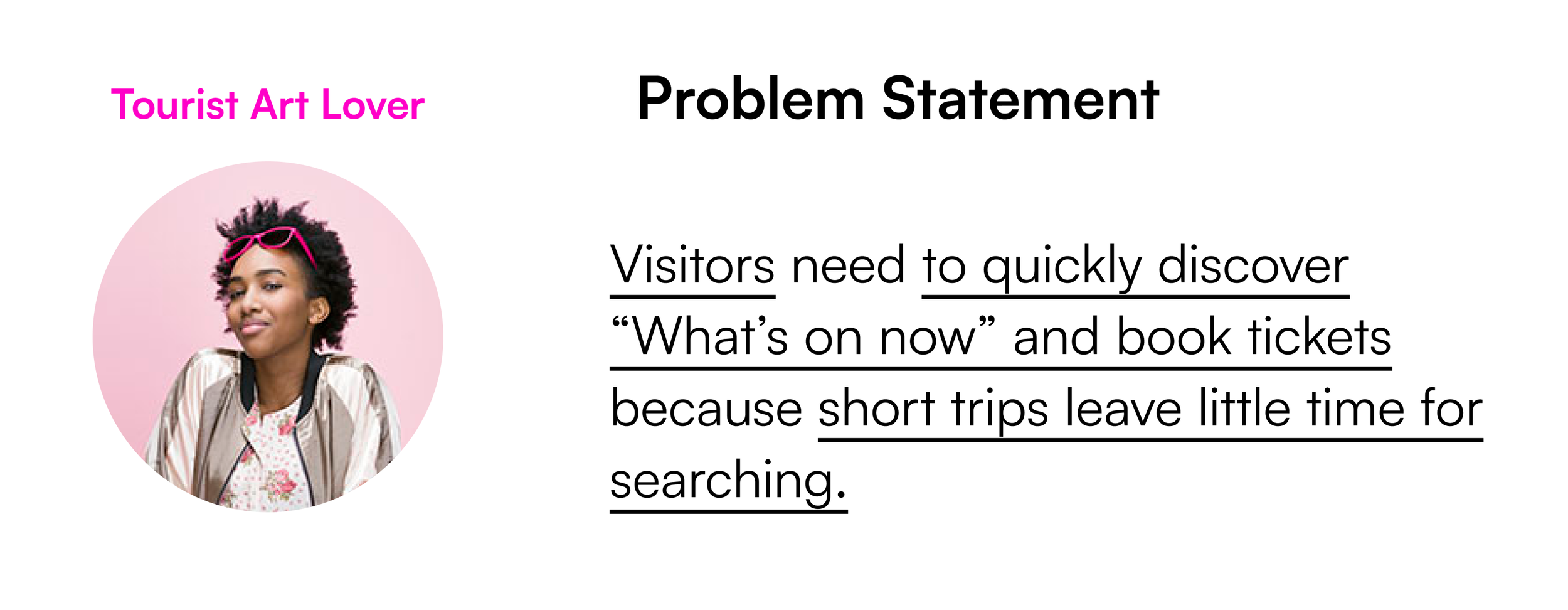
Tourist Art Lover
How might we make discovering exhibitions and booking tickets effortless for short-term visitors?
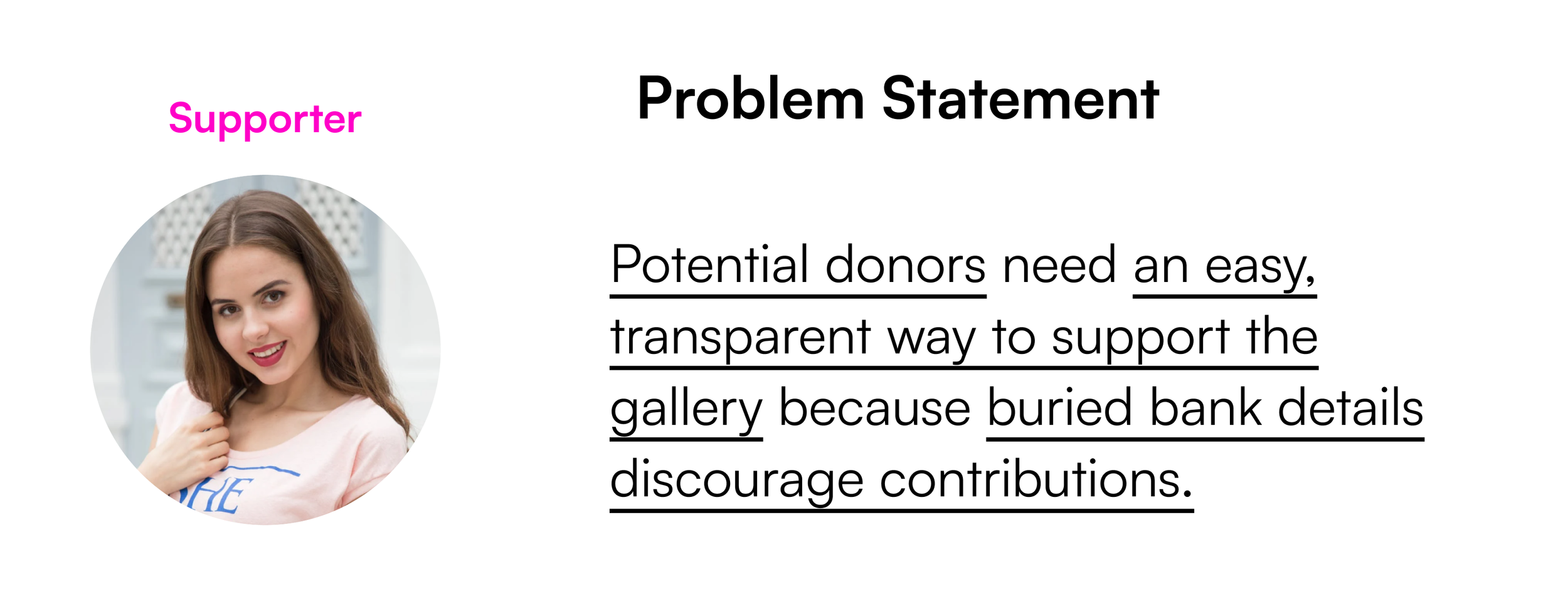
Supporter
How might we make supporting PLATO transparent, simple, and rewarding?
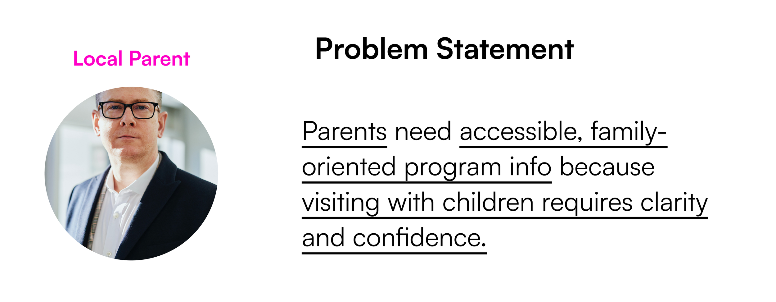
Local Parent
How might we surface family programs and accessibility info so parents feel confident planning a visit?
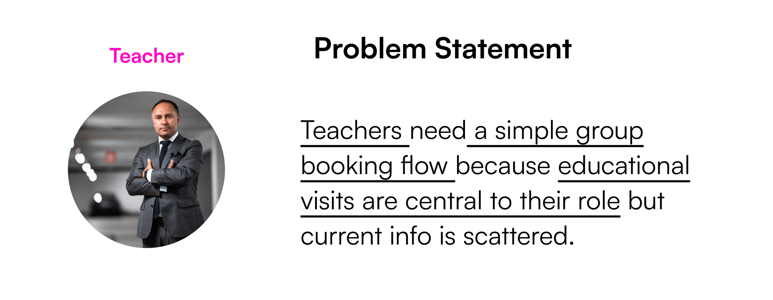
Teacher
How might we streamline group bookings and highlight educational resources for schools?
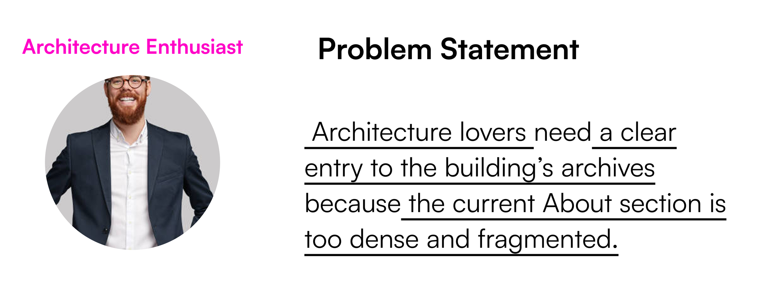
Architecture Enthusiast
How might we bring the building’s story and archives to life in an engaging, navigable way?

IDEAS GENERATED
From the How Might We questions, several clear directions emerged:
A “What’s On” page to capture exhibitions, news, and events happening now;
A clearer content hierarchy so information is scannable and less overwhelming;
Persistent CTAs (Book, Donate, Buy Ticket) placed at decision points;
Simplified user paths for planning a visit, exploring archives, and supporting the gallery;
A more intuitive navigation structure, reducing backtracking and confusion.
GOAL STATEMENTS
Our redesigned PLATO website will let diverse audiences (tourists, parents, teachers, enthusiasts, and supporters) easily plan visits, explore exhibitions and archives, and support the gallery. This will increase accessibility and engagement while preserving PLATO’s bold artistic identity.