REFINING THE VISION: DESIGN SYSTEM & UI
The final UI brings Dreamy’s mystical identity to life through a carefully built design system. With a dark mode foundation tailored for nighttime use, the interface combines calming contrasts, luminous accent colors, and smooth components to create an experience that feels both intuitive and immersive. Every element, from typography to buttons, was designed for accessibility, consistency, and a sense of wonder.”

FROM DREAMS TO DISCOVERY
Guided by usability insights, I distilled Dreamy into a cohesive design system built for nighttime use: a dark-mode foundation with accessible contrast, luminous accents, and a calm, mystical mood. The system defines clear typography hierarchy (headings to captions), tokenized color roles (backgrounds, surfaces, text, accents, states), and reusable components (buttons, inputs, chips, toggles, cards) constructed with Auto Layout for responsiveness and consistency. These decisions ensure scalability across screens, reduce cognitive load in key flows (recording, morning prompts, therapy export), and keep the interface intuitive, legible, and emotionally resonant.
DESIGN SYTEM & UI: FROM INSIGHTS TO INTERFACE
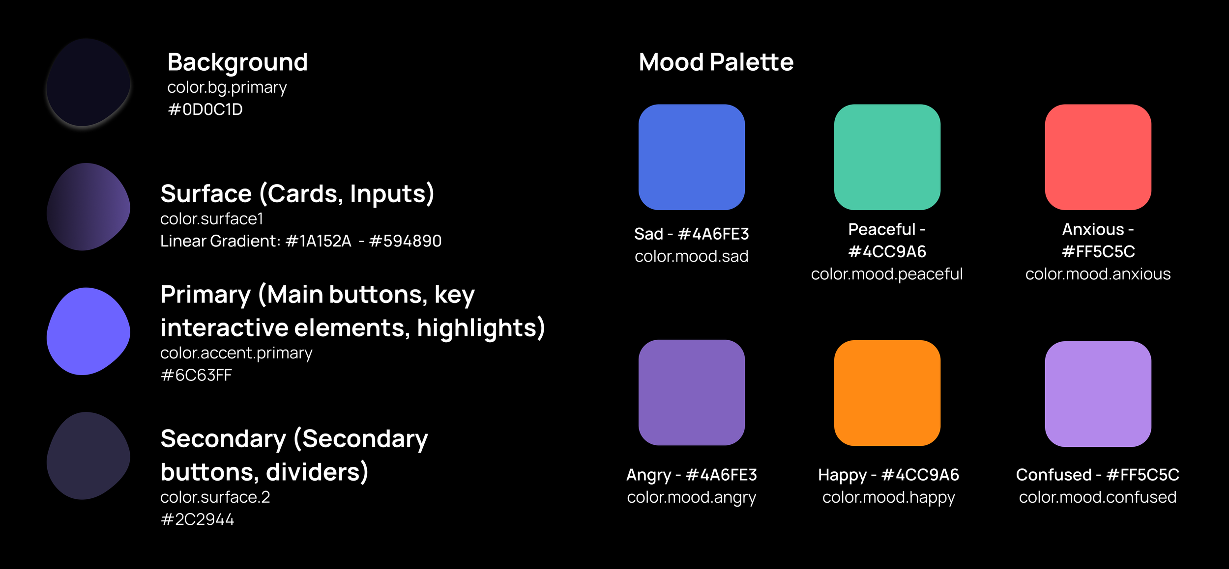
COLOR PALETTE
The palette is designed for low-light use, reducing eye strain while creating a deep, dreamlike atmosphere. Contrast ratios meet WCAG AA standards for accessibility.

TYPOGRAPHY
The type scale prioritizes readability and establishes a clear hierarchy. Manrope is the primary typeface for its modern, geometric clarity. Inter is used stylistically for italic guidance text.

COMPONENTS & UI ELEMENTS
The component library was meticulously crafted to support the app's core themes of introspection and mystery while ensuring utmost usability in a low-light environment. Every element was designed to feel like a tangible object in a dreamscape. Buttons and input fields feature a generous 12px border radius, giving them a soft, pill-like tactility that is inviting to touch. The signature linear gradient surface (#1A152A - #594890) is applied consistently to cards and containers, creating a sense of depth and ethereal luminosity that distinguishes interactive elements from the deep #0D0C1D background. To guide user interaction without jarring contrasts, a delicate 1px solid #594890 border defines inputs and cards, providing just enough definition. The components are built on a strict 4-point grid system, with a standard 24px screen margin and consistent padding values, creating a rhythmic and calming visual harmony. This systematic approach ensures that even the most intricate dream journal entry feels structured and secure, while the visual design remains softly immersive and true to the nocturnal journey.
SPACING & LAY-OUT
A consistent 4-point grid system creates visual rhythm and harmony. All dimensions, padding, and margins are multiples of 4.
Base Unit:
4px<
Common Spacing Values:
8px,16px,24px,32px,40pxScreen Margin:
24px- The consistent gutter on the sides of all screens.Content Grid: A flexible grid with
24pxmargins and16pxgutters between elements.

IMAGERY & EFFECTS
Corner Radius:
12pxis used consistently across all interactive components (buttons, inputs, cards) to create a soft, tactile feel.
Background Effect: The linear gradient (
#1A152A→#594890) is the signature surface treatment, giving the UI its distinctive mystical depth.
DREAMY: THE FINAL EXPERIENCE
Dreamy’s final design translates testing insights into a calm, night-first experience.
A dark foundation with luminous accents, clear typography, and token-driven components keeps the interface accessible and consistent across screens. Core flows are simplified: a focused morning-prompt toggle with time picker, effortless dream capture with autosave and “Save as draft,” graceful cancel confirmations, structured export to the therapy room (checklist + note + success state), and privacy/status controls with Sensitive and Resolved.
Gentle motion supports feedback without glare, and optional voice trigger phrases enable truly hands-free capture after sleep. The result is intuitive, reassuring, and scalable—built to support reflection as much as action.

MORNING PROMPT
Gentle toggle + time picker to nudge recall at wake-up; quick enable/disable from Home.
SENSITIVE MODE
Hide a dream from shared views and notifications; shows a private “Sensitive” badge.
ATTACHMENTS
Enrich entries with sketches, audio, or links; inline previews keep context in one place.
SWIPE TO SET MOOD
Thumb-friendly swipe across mood cards; instant color/tag update for fast categorization.
Record the dream, enrich it with attachments, safeguard it with Sensitive mode, and save - one calm, continuous flow.
THERAPY EXPORT & FEEDBACK
Choose what to send, add a note, get threaded therapist comments, and mark as resolved.
HANDS-FREE TRIGGER PHRASE
Start/stop capture during the sleep window with a custom voice cue - no taps needed.
EXPLORE DREAMY
EXPLORE DREAMY

Explore the hi-fi prototype! Open Dreamy’s core flows and feel the final experience.
*Best viewed full-screen