TESTING: LO-FI GUERRILLA TESTING
WHY I TESTED NOW?
I validated the wireframes before visual polish to keep changes cheap and to verify the core promise of Dreamy in its real context: a half-awake, low-cognition first minute. My guardrails came from the research and HCI principles (Hick’s Law, progressive disclosure): reach first input fast and keep decisions minimal so recall isn’t lost.
METHOD AT A GLANCE
I ran short, mobile guerrilla sessions (think-aloud, ~8–10 minutes each, n=6). I paired them with an expert heuristic review and persona-based cognitive walkthroughs to probe edge cases (permissions, mid-recording exits, sensitive content).
Tasks (1 per persona):
Bianca: Morning Prompt: enable prompt and set a time.
Sonia: Export to Therapy: choose content to share, add a short note, send.
Alex: Expressive Capture: record a dream, add song link + quick sketch, pick a mood, save.

WHAT I MEASURED?
TFFI (Time to First Input): seconds from task start to first meaningful input (tap Record / first character typed).
Required decisions before capture: mandatory choices before recording/typing begins.
Task success: Unassisted / Assisted / Fail.
Errors: critical vs recoverable.
SEQ (1-7): “Overall, this task was easy to complete.”
Privacy clarity (1-5): “How clear/safe did export feel?” (Sonia task only).
Pass/guardrails: median ≤5s to first input; <2 required decisions; ≥90% unassisted success; SEQ ≥5/7; Privacy ≥4/5.

Each row is one task run; columns record participant, task, Time-to-First-Input (TFFI), required decisions before capture, success, errors, SEQ (1-7), privacy clarity (1-5 for Sonia), and notes.
RESULTS - PILOT (INDICATIVE)
· 89% task success
· 83% ≤5s to first input
· 89% ≤2 decisions
· SEQ 5.56/7
· Privacy clarity 4.20/5

WHAT I LEARNED BEYOND THE NUMBERS (FUNCTIONALITY & STRUCTURE)
Settings overload in the first run: people read more than I expected; putting frequency + summary options together increased hesitation.
Exit anxiety while recording: closing or navigating back without a safety net felt risky, even with autosave messaging.
Discovery & edit affordances: the sketch tool and some edit icons were small or visually neutral; back paths worked, but “where am I going back to?” wasn’t always obvious.
Sharing ambiguity: participants wanted certainty about what exactly was sent and a way to see that later.
Tone matters: gentle, plain-language reduced effort; instruction-like text increased it.
HOW I ANALYZED
I logged timings and outcomes per task, then triangulated with notes from the think-aloud and the heuristic/cognitive walkthroughs. I looked for converging failure points (e.g., Morning Prompt step count) and systemic friction (e.g., discovery of secondary inputs). I used the guardrails as decision gates: anything pushing TFFI above ~5s or adding decisions before capture was a candidate for redesign.
WHAT I CHANGED
Simplified Morning Prompt
Consolidated to a single Notifications toggle with an optional Weekly Summary (moved out of the initial enable flow).
Reduced steps and tightened copy so setting a time feels like part of the same decision, not a new one.
Save as draft (explicit safeguard)
Added a “Save as draft?” intercept on close during capture; reinforced autosave state with clearer feedback.
Reduced exit anxiety and recoverable errors.


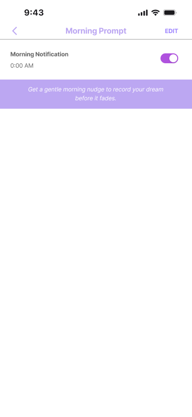

Overloaded setup: multiple notification options and nested settings created extra decisions and slowed first input; the time picker felt like a separate task.


One clear path: single Morning Prompt toggle with inline time, optional Weekly Summary moved out, instant confirmation, and a one-tap return to Home for a smoother, faster flow.
Export you can trust
Added explicit export confirmation and a visible “what was sent” trail in Therapy Room.
Introduced Mark as Sensitive state + plain-language privacy microcopy.
Make secondary inputs obvious, not loud
Surfaced the sketch affordance next to voice with clearer iconography and tap target; kept flow inline (no modal jump).
Kept mood chips at entry; improved spacing and hit-areas.
Micro-interactions & navigation clarity
Clearer back labels (destination hints) and larger edit affordances.
Subtle feedback on save/attach to signal progress without cognitive cost.
Lo-fi (before): No draft option forced a pressured finish-or-abandon decision, and the terse copy amplified anxiety.
Hi-fi (after): A gentle “Save as draft?” safeguard with an autosave cue and clear CTAs (Resume later / Continue) lets users pause safely without losing progress.


